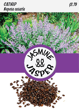
“Cat and Caboodle” is a whimsical product catering to our feline friends in the most delightful and innovative way. This project showcases a unique product line designed explicitly for the Cat family, comprising two essential seed products: Cat Grass and Catnip.
Tools
Adobe Illustrator
Adobe Photoshop
Adobe Stock Images
Canon 7dmii
Canon 100mm
Categories
Logo Design
Branding
Product Design
Packaging Design
Web Design (WordPress)
The Project Vision
Minimal Design
Responsive Design
Creative Idea


A Story in Research
Understanding the unique dietary requirements of cats and their affinity for certain plants was the first step in our research. Extensive studies on feline behavior and herbal remedies laid the foundation for the project. We delved into the world of sustainable packaging, seeking eco-friendly materials and methods to minimize our environmental footprint. Market analysis helped identify the gap in the industry, highlighting the need for a convenient, all-in-one solution for cat owners.
Creative Process
The product design of the box packaging was meticulously mocked up, considering every detail, from dimensions to visual appeal. Real photographs, combined with stock images, were seamlessly integrated into the design, adding authenticity to the seed packets. The focus was not just on aesthetics but also on functionality; the inclusion of soil pods that expanded upon watering transformed the packaging into a mini garden, enhancing the overall user experience.
Creative Journey
Armed with research insights, the creative journey began. Adobe Illustrator and Adobe Photoshop became our tools of choice, allowing us to translate ideas into visual concepts.
Packaging
The box packaging was meticulously mocked up, considering every detail, from dimensions to visual appeal. Real photographs, combined with stock images, were seamlessly integrated into the design, adding authenticity to the seed packets
Functionality
The focus was not just on aesthetics but also on functionality; the inclusion of soil pods that expanded upon watering transformed the packaging into a mini garden, enhancing the overall user experience


